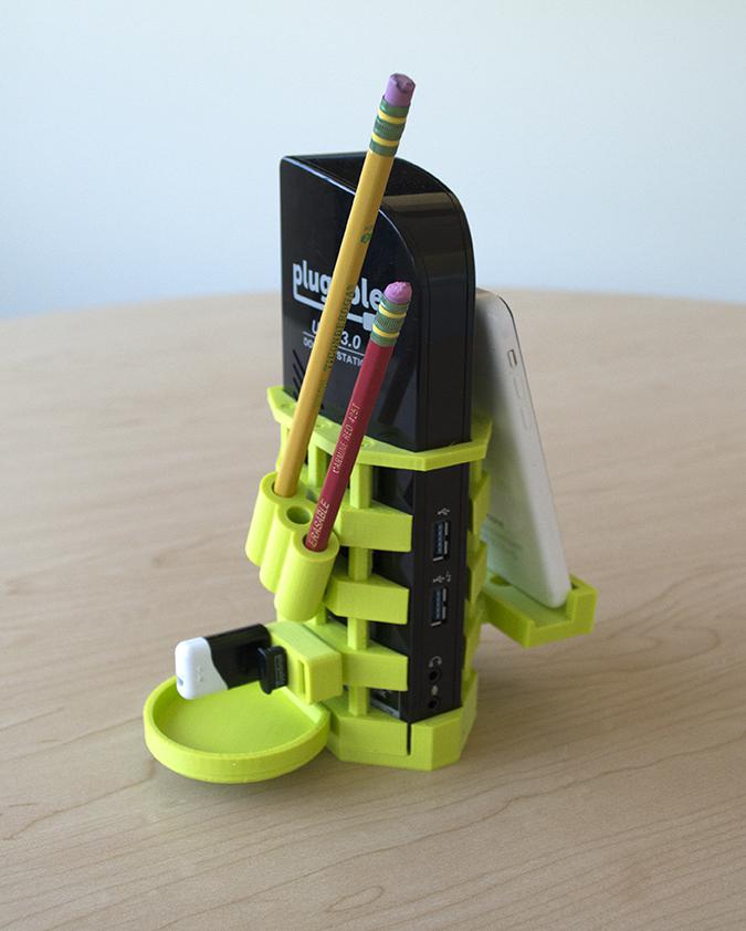
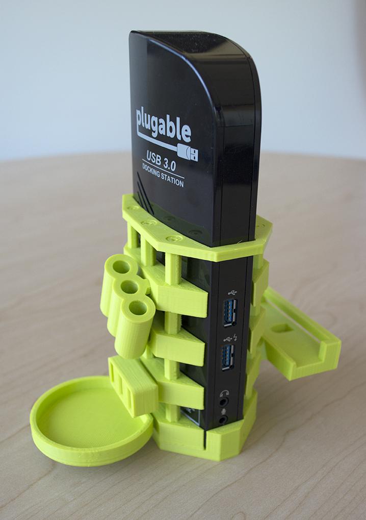
This week, I revisited my old friends the UD-3900 and UD-3000 docking stations. Previously, I designed a VESA mount system to hold the docking station in place behind a monitor. This time around, I wanted to create something that would make our docking stations a focal point of the desk—foregoing overt minimalism in favor of a funky, angular asymmetry that grabs attention to the device.
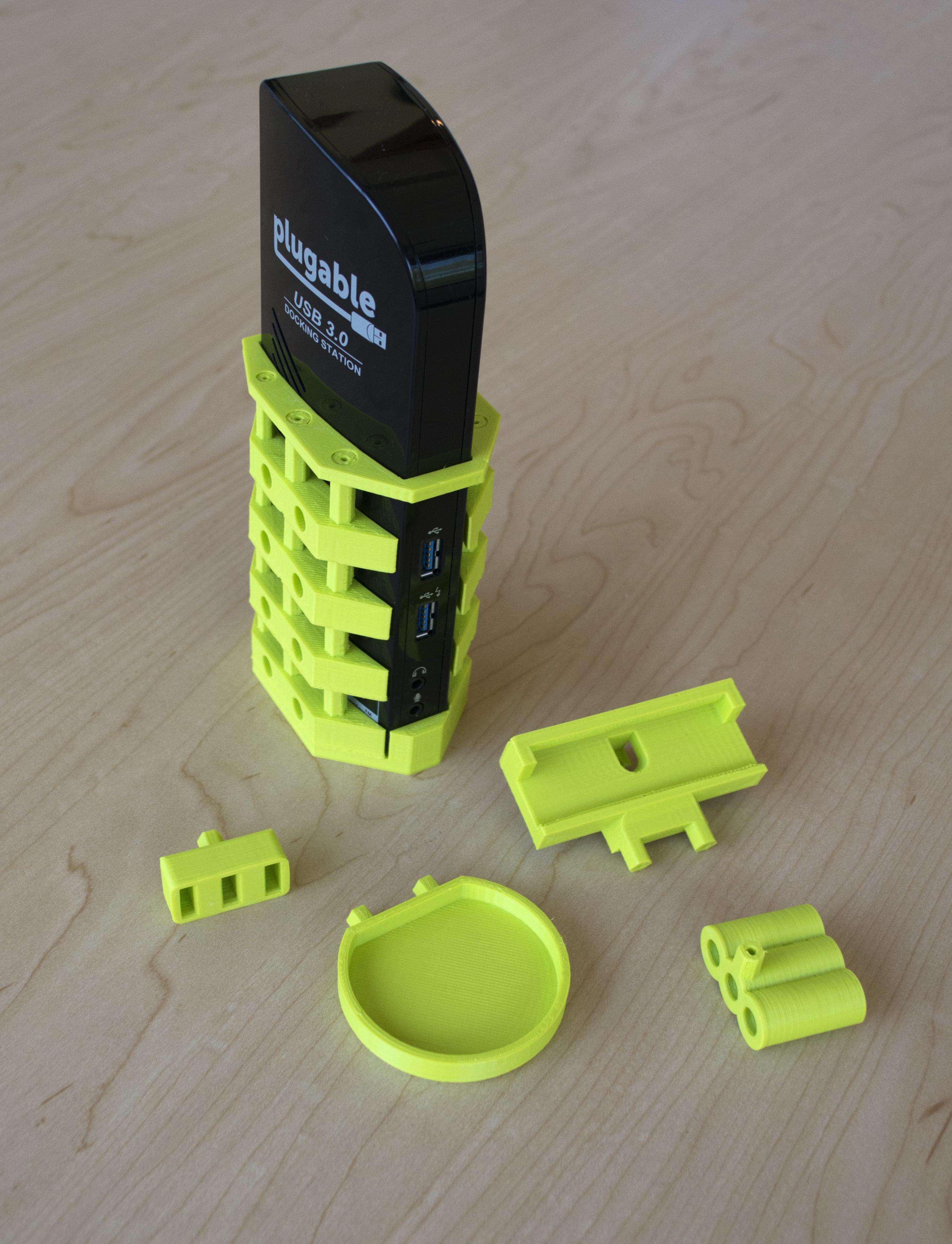
I also wanted to increase the utility of the docking station so that it was more than a passive desktop sentinel. To do this, I made a series of accessories to click into the brackets. These expanded the usefulness of the dock and encourage people to interact with it in new ways throughout the day.
Here is the link to the final product on thingiverse.com. I was inspired by space station design where modules get added to the core structure over time as needed.
From my previous project, I got interested in modularity as a method to create interesting and customizable workstations. I wanted to further explore this direction. By breaking the design into many smaller components, the design process for each piece is more simple than trying to cram all the same functionality into one piece. For example, the bracket pieces do not need to wrap the docking station on all four sides because the top piece can be positioned to hold the brackets together.
So far there are four add-ons available. If you have any suggestions for a new one, please let me know in the comments!


Loading Comments